Introduction to Bars/ja: Difference between revisions
(Created page with "{{Languages|Introduction_to_Bars}}{{Translation}}{{DISPLAYTITLE:はじめての状況ゲージ|はじめての状況ゲージ}} <div style="color: gray;">Bars are a Introduc...") |
m (Taustin moved page introduction to Bars/ja to Introduction to Bars/ja over redirect) |
||
| (2 intermediate revisions by 2 users not shown) | |||
| Line 92: | Line 92: | ||
# '''In the Token Right-Click/Context menu''': You can select a bar from the {{ui location|Token Context Menu > Bars Submenu}}, selecting the bar you'd like to display on the token. In the resulting dialog, uncheck 'Hide' and select the percentile you'd like the bar to appear at on the token. To hide the bar in the future, re-check the 'Hide' checkbox. This can be done with multiple tokens selected at once to set all their values for a bar at the same time. | # '''In the Token Right-Click/Context menu''': You can select a bar from the {{ui location|Token Context Menu > Bars Submenu}}, selecting the bar you'd like to display on the token. In the resulting dialog, uncheck 'Hide' and select the percentile you'd like the bar to appear at on the token. To hide the bar in the future, re-check the 'Hide' checkbox. This can be done with multiple tokens selected at once to set all their values for a bar at the same time. | ||
# '''In the Token Properties dialog''': In the 'State' tab, you will see 'Hide' checkboxes and sliders for each defined bar. Uncheck 'Hide' and select the percentile you'd like for each bar you want to appear on the token. | # '''In the Token Properties dialog''': In the 'State' tab, you will see 'Hide' checkboxes and sliders for each defined bar. Uncheck 'Hide' and select the percentile you'd like for each bar you want to appear on the token. | ||
# '''Using macros''': Bars are most useful when they are automated by MapTool macros. To learn more, read the [[HP | # '''Using macros''': Bars are most useful when they are automated by MapTool macros. To learn more, read the [[HP and Health Bars]] macro tutorial or about [[:Category:Bar_Function|bar macro functions]] and the [[bar.name]] special variable. | ||
==Creative Bar Examples== | ==Creative Bar Examples== | ||
Latest revision as of 20:23, 15 March 2023
状況ゲージは、マップツールでトークン画像上に情報を表示するキャンペーン用プロパティで、トークンの状態と似ている。『状態』は排他的(有効か無効か)であるが、状況ゲージはパーセント値を設定することができ、ヒットポイント、弾薬、その他の属性値や、数値またはパーセンとで表すことができるリソースなどの一般的なゲーム属性にとって便利である。状況ゲージは、トークン上にあるいずれの状態マークより常に上側に描画される。
INTERMEDIATE
THIS IS AN INTERMEDIATE ARTICLE
状況ゲージの作成と編集

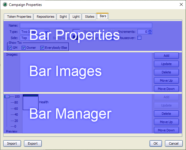
Edit Menu > Campaign Properties > Bars Tab. The Bars tab has 3 distinct areas: Bar Properties, Bar images, and the Bar Manager.状況ゲージは、編集メニュー>キャンペーン設定>Barsタブで表示、追加、更新、および削除できる。Bars タブには、Bar Properties、Bar images、Bar Manager の3つの領域がある。
- Note: The first thing many users notice about the Bars tab is that there are two identical sets of buttons along the right side (Add, Update, etc).
- The top set of buttons apply only to Bar Images on the bar you are currently working on.
- The bottom set of buttons applies to the Bar Manager, and is used to actually add or update bars.
Once the Bars Tab is opened, you can create a new bar by setting the Bar Properties, adding any needed Bar Images, and then hitting the 'Add' button in the Bar Manager. Here is a basic procedure for creating a two-tone bar to show a token's HP:
- Enter a unique Name, such as Two Tone HP Bar.
- Set Bar Type to Two Tone Bar
- Set the Bar Color to a bright green.
- Set the Background to black.
- Click Add next to the Bar Manager (the second set of buttons).
Voila! Your new bar should appear in the Bar Manager's list of bars. To update the bars color, you can click on the bar, change the Bar Color, and hit the Update button in the Bar Manager.
Read on for full documentation of the Bars interface, using bars in game, and examples.
Bar Properties
All bar properties are visible for all bar types, even if a property doesn't apply to the current bar type. When a property isn't used for the selected bar type, it is grayed out.
- Name: The name of a bar. Each bar must have a unique name.
- Tip: Entering an existing bar's name here will not let you 'update' the existing bar with that name. You must instead select the bar you wish to update in the Bar Manager.
- Type: The bar type. Different bar types use different properties and images. All bar types except Single Image bars have their 'full' value on the right-hand side of the token and reduce right-to-left as their value decreases (or from top-to-bottom for vertically set Color Bars).
- Two Image (Image bar): A bar consisting of a 'Bar' image over a 'Base'/background image.
- Single Image (Image bar): A bar consisting of a single 'Bar' image.
- Tip: Unlike all other bar types, Single Image bars have their 'Full' value on the left side and reduce from left to right.
- Multiple Image (Image bar): A bar with an image assigned to each Increment, plus an image for when the bar is 'Empty'/set to 0.
- Solid (Color bar): A Color bar with nothing but a solid bar color.
- Two Tone (Color bar): A Color bar with a solid bar color over a second solid color as a background. The background borders the full bar, slightly squishing the bar value within it's boundaries compared to the Solid bar.
- Bar Color (Color bars only): The color of the bar which matches the bar value.
- Thickness (Color bars only): A value from 2 to 10 to define how thick a bar is in pixels. Solid bars use 2 pixels to create a border.
- Tip: Color Bars (Solid and Two Tone) display at the same thickness regardless of zoom level, and are usually more visible than Image bars when very zoomed out and less visible when very zoomed in. Color bars can subsequently be useful for hit points on large-scale maps with many units.
- Increments: A value from 0 to 100 to set the amount of states the bar will display. Setting to '0' is a special value that will let the bar be continuous, handling a much greater degree of precision.
- Tip: 'Empty' (0%) is always the first Increment (consider Empty as 'Increment 0'). The remaining increments are divided evenly across your bar as
Increment Number / Increments - 1. Your bar should have at least 3 increments if you want to show any in-between values.- For example, A bar with Increment set to '5' will calculate increments at Empty (0/4, 0%), Full (4/4, 100%), and 3 intermediate steps cl: Increment 1 (1/4, 25%), Increment 2 (2/4, 50%), and Increment 3 (3/4, 75%).
- Tip: When choosing how to display a bar, the bar value is always rounded up to the next increment, even if it is only barely above the previous one. This can be a bit confusing until you get the hang of it, so see the following example and test out bars you make with the 'Preview' tool in the Bar Manager.
- For example, a bar with Increments set to '5' will display as follows:
- Increment 0 ('Empty', 1st increment, 0/4) displays when the bar value is exactly 0%,
- Increment 1 (2nd increment, 1/4) will display at bar values greater than 0% up to exactly 25%.
- Increment 2 (3rd increment, 2/4) will display at bar values greater than 25% up to exactly 50%.
- Increment 3 (4th increment, 3/4) will display at bar values greater than 50% up to exactly 75%.
- Increment 4 ('Full', 5th increment, 4/4) will display at bar values greater than 75%.
- Tip: 'Empty' (0%) is always the first Increment (consider Empty as 'Increment 0'). The remaining increments are divided evenly across your bar as
- Side: The side of the token the bars will appear on. When on the left or right side, a bar's 'full' value is at the top and reduces from top to bottom.
- Tip: Image bars can be set to a side, but are constrained by their image ratio. For predictable results, Top or Bottom Image Bars should have wide image ratios, while Left or Right Image Bars should have tall image ratios. Square images will fill the whole token's area regardless of Side, though the direction the bar reduces will change.
- Tip: While Single Images reduce from left-to-right on the Top or Bottom, they reduce from top-to-bottom when set on the Left or Right just like any other bar type.
- Background (Two Tone bars only): The color of the background behind the bar, displaying to the full thickness.
- Opacity (Image bars only): A percentile value between 5 (nearly transparent) and 100 (completely opaque), set in steps of 5%.
- Mouseover: When ✓checked, the bar will only appear when the mouse is hovered over a token.
- Show To: Who can see the Bar when it is enabled on a token. At least one of these must be checked for each bar.
Bar Images
The Bar Image area appears for all bars, but is only used for Image Bars (Single Image, Two Image, and Multiple Images bar types). For Color bars, all the Bar Image buttons are grayed out. Images are always 'squished' to be square in the Bar Image area, but the correct image ratio is used on the actual bar.
- Add: Adds an image to the bar you are working on. Next to the image, a label will appear with how the image will be used in the bar.
- Tip: Unlike many other file pickers in MapTool, you can select any image on your local disk rather than only images in your Resource Library.
- Tip: You can add more images than an Image Bar strictly needs while you work on the bar. These will be labelled as 'Unneeded' and appear at the bottom of the Bar Image list. To use these images, you can rearrange the list with the 'Move Up/Down' buttons. You must remove unneeded images before you can add or update an Image Bar.
- Update: Reopens the file picker and Updates the selected image with a different image.
- Delete: Removes the selected image from the bar you are working on.
- Move Up and Move Down: Rearranges the selected image in the list of images.
Bar Manager
The Bar Manager lets you see all of the open campaign's currently defined bars. Selecting a bar in the Bar Manager will immediately replace the Bar Properties and Bar Images with the selected bar, so be careful not to select a bar if you are already working on one.
- Add: Adds the current bar you are working on as a defined bar in the campaign. This option is only available if the Name is unique and all the properties are valid. Additionally, Image Bars can only be added once all their images are added in the Bar Images area.
- Tip: Multiple Images bars cannot be added unless they have at minimum one image for every Increment.
- Update: Updates the selected bar. You cannot update a bar without selecting it first, even if you entered the bar's exact name in the Name field.
- Delete: Deletes the selected bar. There is no confirmation, so be careful with this option.
- Move Up and Move Down: Moves the selected bar up or down the list relative to the other bars.
- Tip: Bars are drawn in the order they appear in this list, the last bar will appear on top of other bars. This is important for bars that are designed to be stacked on top of each other.
- Preview Slider: Use this slider to see what all the bars will look like at the given value. This is very helpful to make sure your bars are working as expected before saving your changes.
Applying Bars to Tokens
There are three ways to apply a bar to a token.
- In the Token Right-Click/Context menu: You can select a bar from the
Token Context Menu > Bars Submenu, selecting the bar you'd like to display on the token. In the resulting dialog, uncheck 'Hide' and select the percentile you'd like the bar to appear at on the token. To hide the bar in the future, re-check the 'Hide' checkbox. This can be done with multiple tokens selected at once to set all their values for a bar at the same time. - In the Token Properties dialog: In the 'State' tab, you will see 'Hide' checkboxes and sliders for each defined bar. Uncheck 'Hide' and select the percentile you'd like for each bar you want to appear on the token.
- Using macros: Bars are most useful when they are automated by MapTool macros. To learn more, read the HP and Health Bars macro tutorial or about bar macro functions and the bar.name special variable.
Creative Bar Examples
Health Blocks

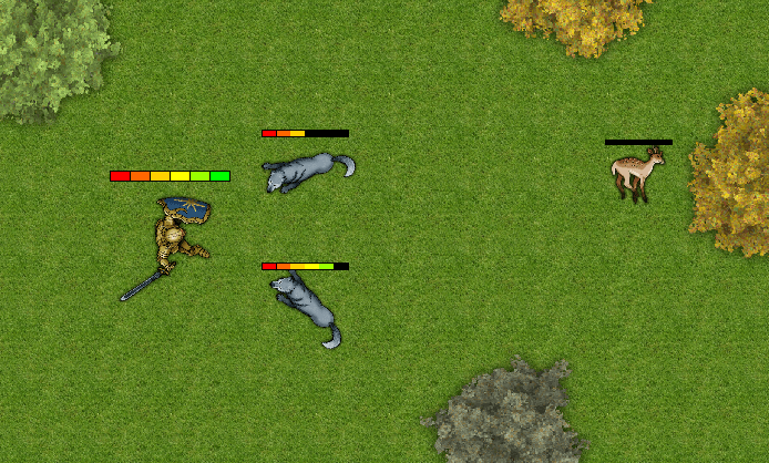
By using graphics with clear divisions, you can make clearly discrete Image Bars that can help players better visualize and estimate token condition.
The sample pictured was created using the 'Two Image' bar type with Increments set to 7. If you want the blocks or bubbles to change color or be different sizes, you can use the 'Multiple Images' bar type for even more flexibility, such as a graphical health bar that looks pristine at 100% and appears to 'break' incrementally as health decreases.
Overlapping Bars for Temporary Hit Points

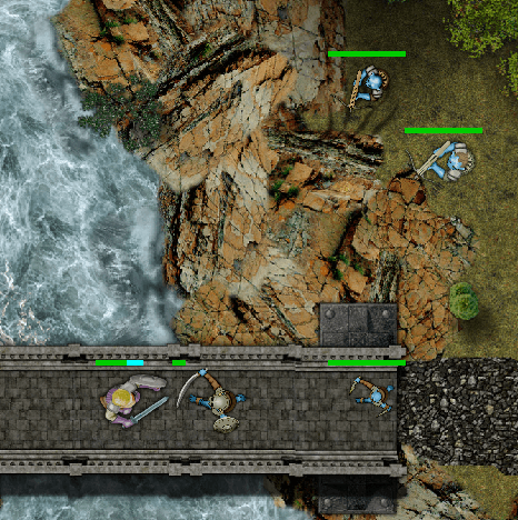
You can apply any or all of the bars in a campaign to a single token at the same time. If you wanted to show more than one bar at a time, note that the rendering order of bars is how they appear in the Bar Manager, top-to-bottom. That means that bars lower in the list are drawn over barns higher on the list.
Overlapping bars can have many useful effects, such as displaying temporary hit points alongside normal hit points. In this example, two Solid type bars are used. Current HP are in green, and temporary HP are in cyan. For more complex overlapping effects, one could use partially transparent images in Image Bars. See the next example for one such example.
Padded Images for Stacked Bars

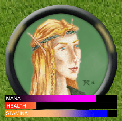
Stacked bars can be achieved by creating Image Bars with transparent padding where other bars will appear. This can be useful to pack a lot of information into a token's image using bars.
In this example, 3 Two Image type bars were used, all the same dimensions to create a stacked bar effect. Here are the images used to illustrate the example:

Known Bugs
- Observed in 1.5.10
- While you cannot add a Bar with a name matching an existing Bar, you can update an existing Bar's name to do so, which can cause undefined behavior.
- You can set 'Increments' to 1, which forces an always-empty state.
- Opacity has no effect on Color Bars.


